NO Tie Laces Logo: designing a new SuperLaces logo
Since committing to the relaunch of the laces, I’ve gone ’round and ’round about the logo. Do we adapt the old SnapLaces logo or start fresh? It’s not a purely aesthetic decision either. If we are going to the effort to design a new no tie laces logo, it should incorporate our evolution as well as our history.
For one, all of our existing materials, marketing, inventory, instructions, etc bear the mark. Even though we are updating this stuff anyway – new means new and it’s a ton of work to replace.
Second, I love the existing logo. The design was led by a close friend when we worked together and it was done at a time that was full of promise for what we were building.
Third, this will be the third time I’ve been involved with a logo design for the laces. How are we going to come up with something new, fresh, or frankly better?
So this is the backdrop of the project! Redesign a logo you love, for the third time – and make it better!
experiments in designing a new no tie laces logo
The truth is, I didn’t fully commit to the redesign, until I had actually decided to use the old mark. The act of making that psychological shift to go with it, never felt comfortable. Try as I might – it represented what was, not what is to be.
So over the last few weeks I’ve had a pad of paper on my desk – sketching during calls and generally just doodling with ideas. Most of the time, these concepts never made it past the days meetings…quickly being dispatched to the shredder or serving as the fodder for the evening fire.
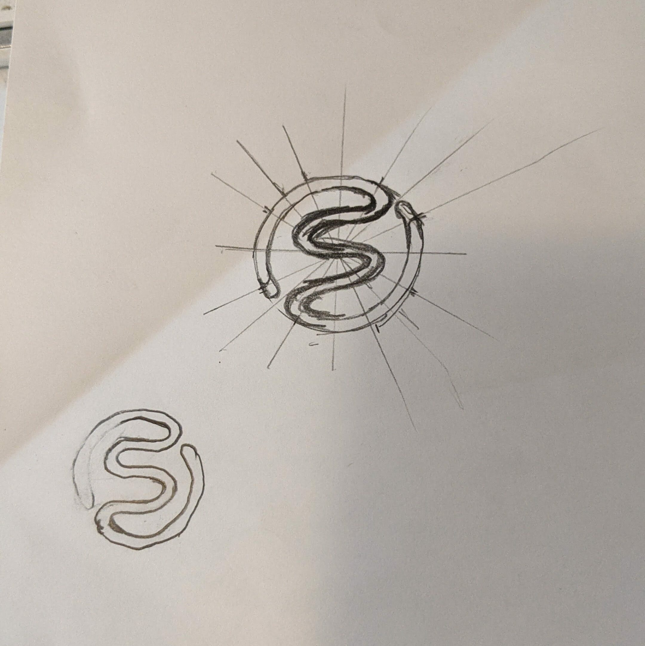
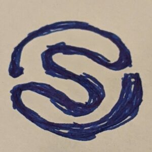
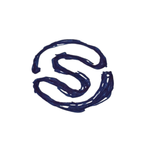
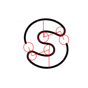
Then a couple weeks back, while experimenting with the “S” a vague concept started to appear that I didn’t hate.
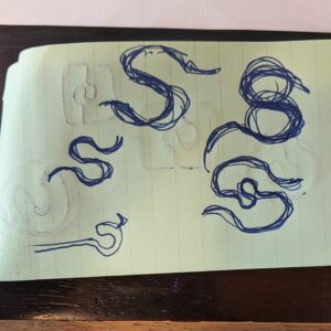
experimenting with logo designs
The “S” as the logo mark is central to the theme, but how do you convey the laces or the values without being too literal or making the design overly complex? The last version hinted at an hour glass, which conveyed our commitment to reducing lace tying time in competition – and getting more time to do other things in life (over a lifetime, the “typical” person will cumulatively spend 4 – 6 weeks tying shoes).
Extending the ends of “S” and wrapping them around led to some interesting designs. I love the concept of fractals and explored the possibility of repetition and growing out from the center, with each successive layer resulting in an ever larger “S”, but couldn’t get it to feel right. The experiment did produce the idea of enclosing the mark in a self generated circle – resembling a lace as the medium.
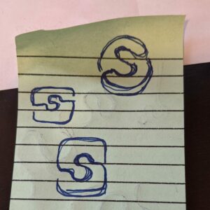
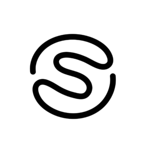
Digitizing and refining the logo
After some additional experimentation and refinement it was time to bring in a real designer to get it digitized and further explore the concept. Sketching is great, but I wanted the actual logo to have symmetry, requiring the use of software and skills beyond my current capacity for learning. As of right now this is where we have evolved the design.
The new symmetrical version has lost the enclosing circle, so I sent it back for additional revision. Smaller radiuses on the inside of the “S” should bring the circle back, make the gap a little tighter, and add a little style to the design.
A temporary design
I had hoped to have the design complete, by this post, by the back and forth messed up the timeline. After the shape is settled, we’ll start to experiment with line widths and color. Then it’s on to typography to round out the full logo.
For now we’ll continue to use a hybrid mark, until we can get this new one just right.